Types of Charts
DEVELOPER
Types of Charts |
DEVELOPER |
PROIV Open Client supports the Line chart, Bar chart, Pie chart and Meter chart. Based on the properties you set for the property sheet, grid, and Forms Designer the charts appears as follows:
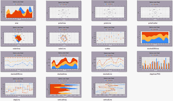
Line Chart:
A line chart uses a line to connect a series of data points. Often, it is used to show data movement, and the comparison between the datasets. In PROIV Open Client, you can represent the line chart in various renditions. However, PROIV MFC supports only the basic rendition.
The line chart displays labels for each data points. You can represent the labels either on x-axis or y-axis. Each dataset can have a color for the fill, a color for the line and a color for a point. You can set all these line chart properties at design time.
There are the specific properties to Line charts which are set to default values. You can override the default values with the new values as per your business requirement.
Example:
Set the Chart_lineType property to represent the Line chart in the following renditions
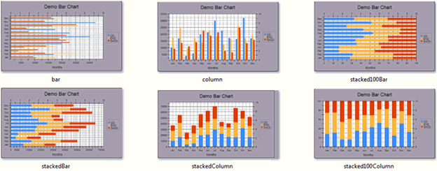
Bar Chart:
A bar chart has rectangular bars with lengths proportional to the values that they represent. Bar charts are used for comparing two or more values. The bars can be horizontally or vertically oriented.
The bar chart has a very similar data structure to the line chart, and has many datasets, each with different colors and data. You can set the bar chart properties at design time.
There are the specific properties to Bar charts which are set to default values. You can override the default values with the new values as per your business requirement.
Example:
Set the Chart_barType property to represent the bar chart in the following renditions
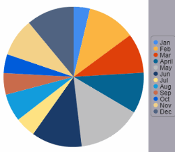
Pie Chart
A pie chart is a circular chart divided into segments, which illustrate relative magnitudes or frequencies. In a pie chart, the area of each sector is proportional to the quantity it represents. Together, the sectors create a full circle. They are excellent at showing the relational proportions between data.
In PROIV, the Pie chart represents one column of numeric data. The pie chart is generated based on the data of the selection cycle. In general, you can use the second column of the selection cycle as legend and the third column as the data to represent the pie segments. All other columns in the selection cycle are ignored.
You can set the pie chart properties at design time, for example, color of the pie segment.
Example:
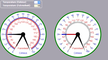
Meter Chart
A meter chart displays information relating to the values for a maximum of three scales and nine pointers in a circular format.
You can change the appearance of the Meter chart by setting the properties at design time. For example, you can use colors to indicate whether the current value is in the regular, warning, or critical range.
|
Note: Meter charts cannot be clicked, so do not support Custom and Standard validation. However, they support the On Focus, Lost Focus logic points and Right-click menu. |
Example:
Topic ID: 500703