Lite Client CRM Demo |
Lite Client |
Lite Client CRM Demo |
Lite Client |
The PROIV CRM demo that is shipped with the PROIV Demo provides working examples of the rich functionality that we have available to use in Lite Client. The individual components that we leverage as part of this demo are detailed below.
On initial entry you will be presented with the lead entry page. You will notice that this demo is distributed with example leads and it is fully functional to allow you to experience the full benefits of Lite Client.
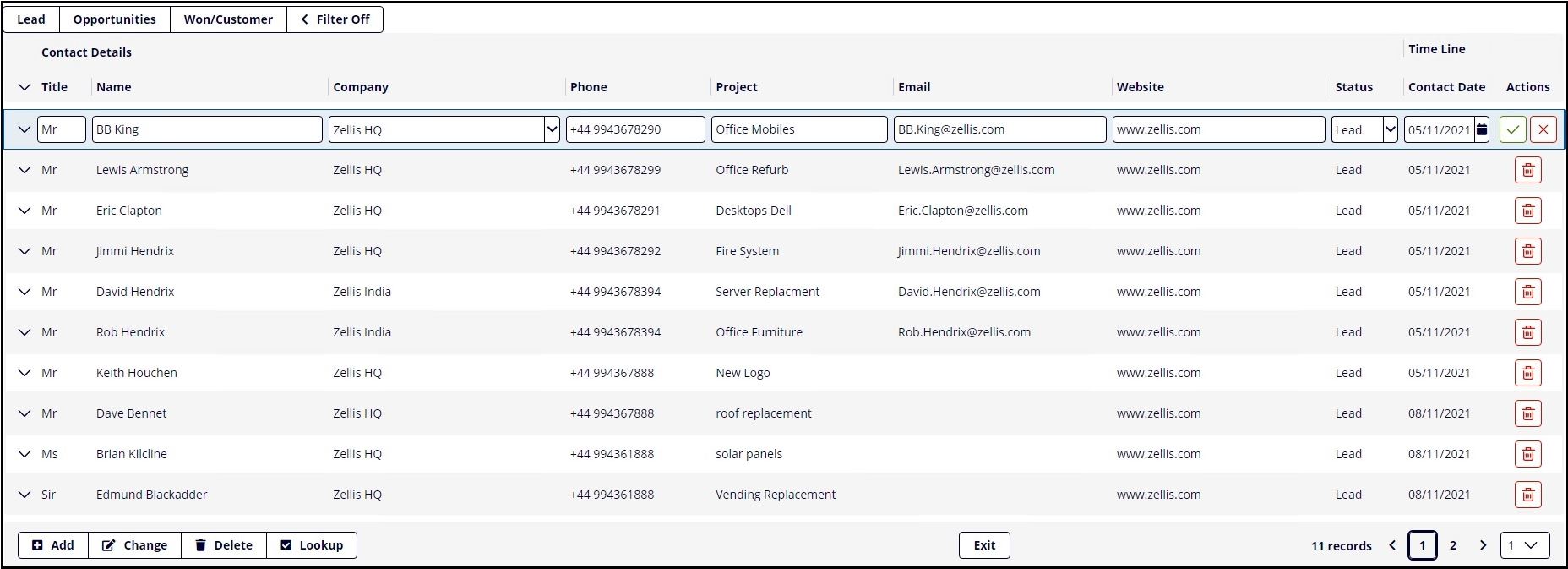
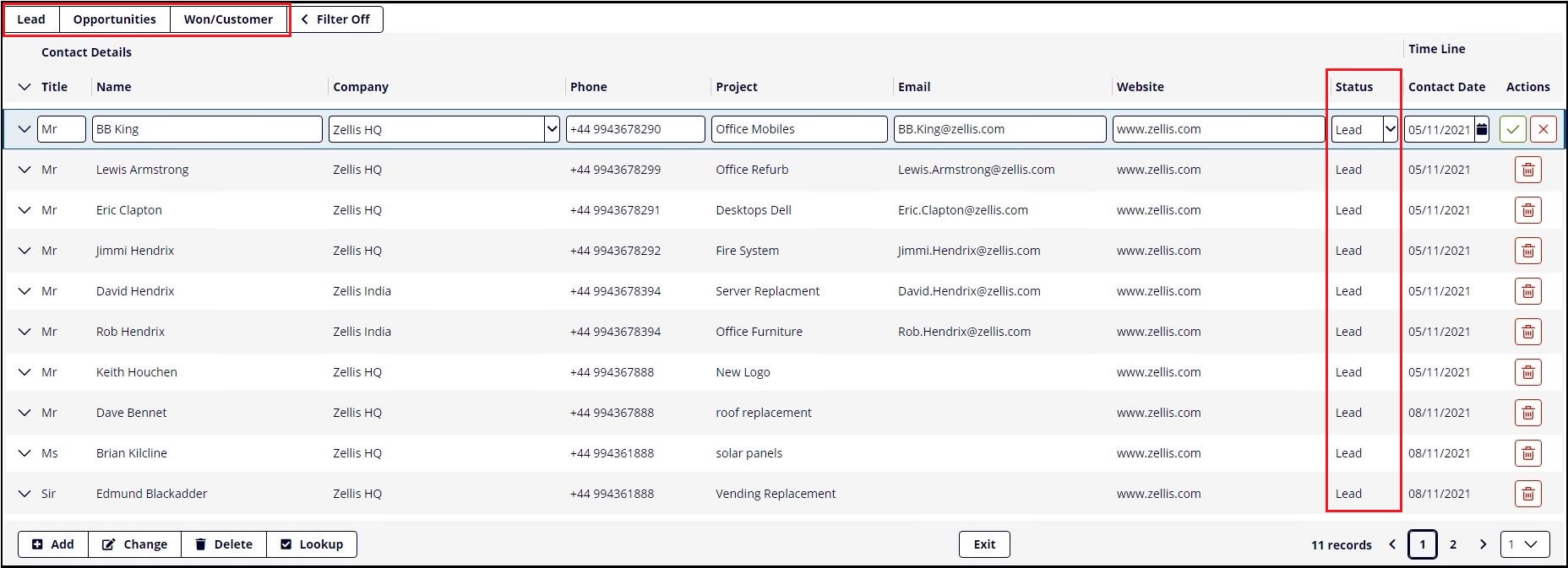
The data is presented by the three key statuses, "Lead", "Opportunity" and "Won". As you change the status using the dropdown the data transitions between the different tabs, giving a clear and intuitive user experience.
One of the key features of Lite Client is the Fluid Grid component. Lite Client uses bootstrap CSS and its responsive Fluid Grid to display the components in the PROIV screen function. This means that the components look and behave differently from the components in existing PROIV clients (Windows Client & Open Client).
The Fluid Grid provides a ‘Responsive’ browser page that adapts its contents to the size of the browser that is displaying it. This means that the experience will be consistent across different devices (laptop, tablet and phone browsers).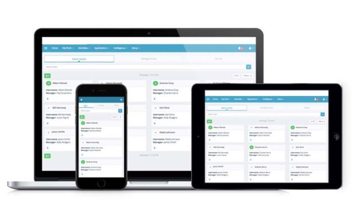
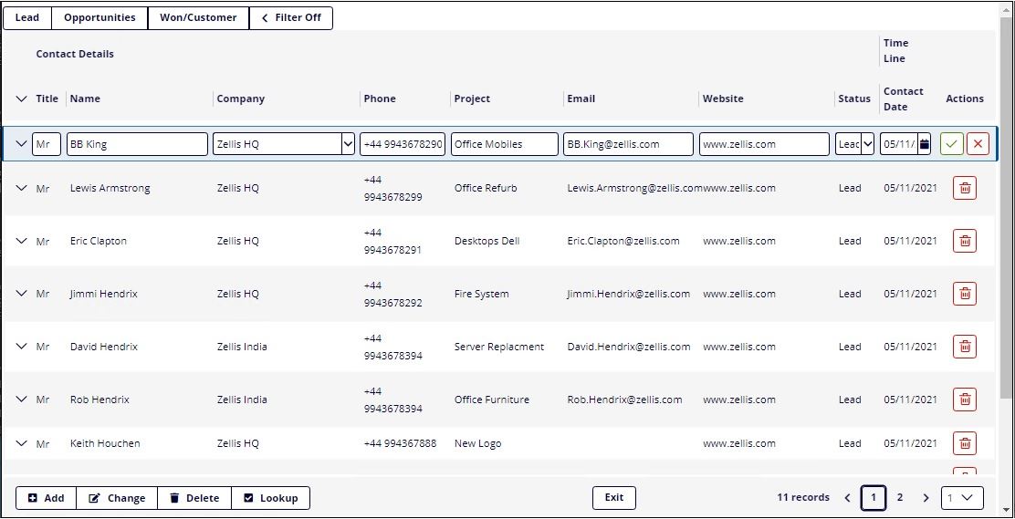
The Paging component used in Lite Client is very different from that used by the Open Client. The Lite Client paging area component has the following features:
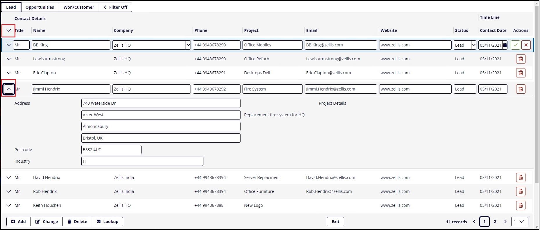
Static buttons and icons can also be tethered to a paging component.
The screen below demonstrates how the mode buttons have been tethered to the paging cycle and located to the bottom left, and the exit button tethered to the bottom right.
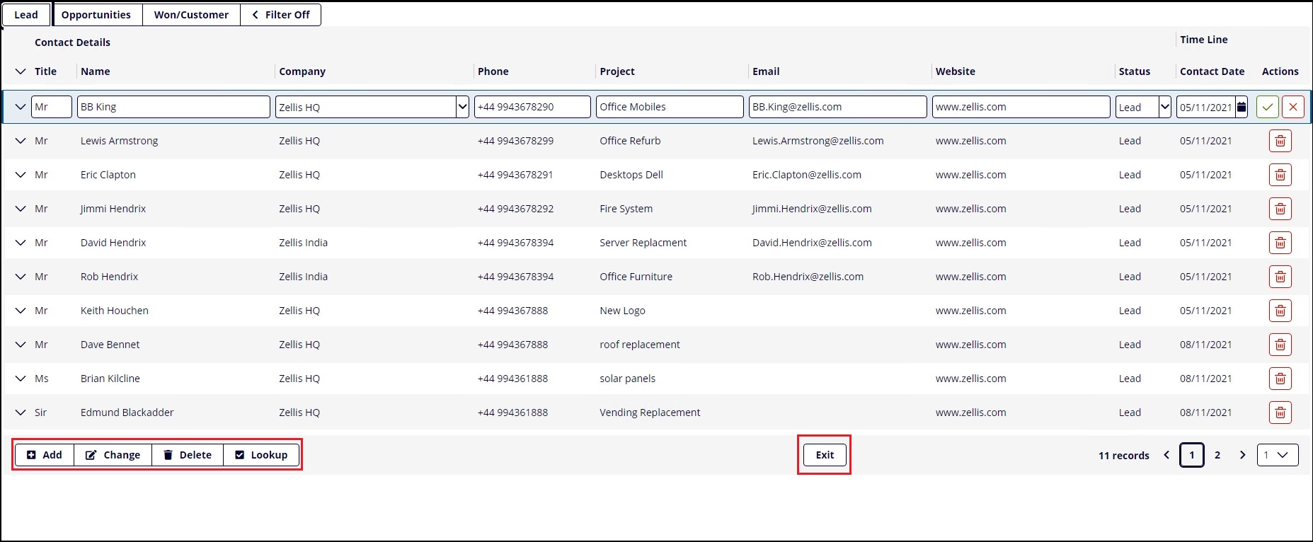
Notice the buttons/icons are docked relative to the last paging row, even when scrolling to the next page of records.

We use the TetherTag and TetherPlacement properties on entry to the paging cycle to achieve this.
//Tether buttons to cycle.
Exit.TetherTag = "PagingCycle"
Exit.TetherPlacement = "bottom_right"
Add.TetherTag = "PagingCycle"
Add.TetherPlacement = "bottom_left"
Change.TetherTag = "PagingCycle"
Change.TetherPlacement = "bottom_left"
Delete.TetherTag = "PagingCycle"
Delete.TetherPlacement = "bottom_left"
Lookup.TetherTag = "PagingCycle"
Lookup.TetherPlacement = "bottom_left"
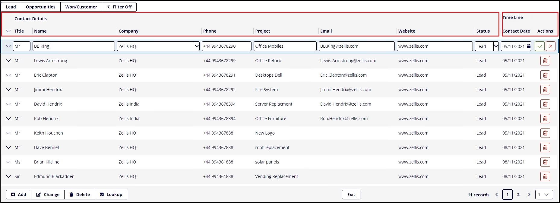
Individual columns of data can also be grouped together using paging header tags.
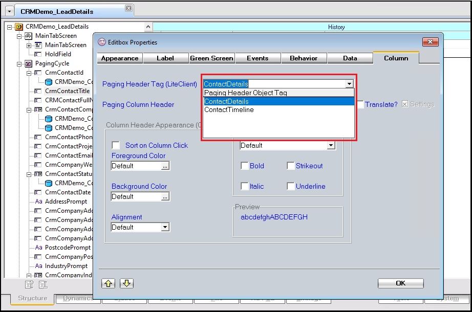
In our example below the contact details which consist of Name, Company, Phone, Email, Website are grouped together under "Contact Details", and the remaining fields that represent when the contact was created, grouped as "Time Line".
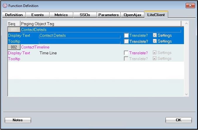
This is achieved by creating the paging objects group tags in the function definition section.
The paging header tags are then attached to the field objects you wish to group together.
The Paging Area has an Actions column that can be turned on/off. The actions are clickable icons that perform an action on the record you have open for edit. The most common action being delete.
The PROIV Developer Paging Screen Cycle has a number of properties that manage the Actions column in the Paging Area grid component. These properties are shown below:
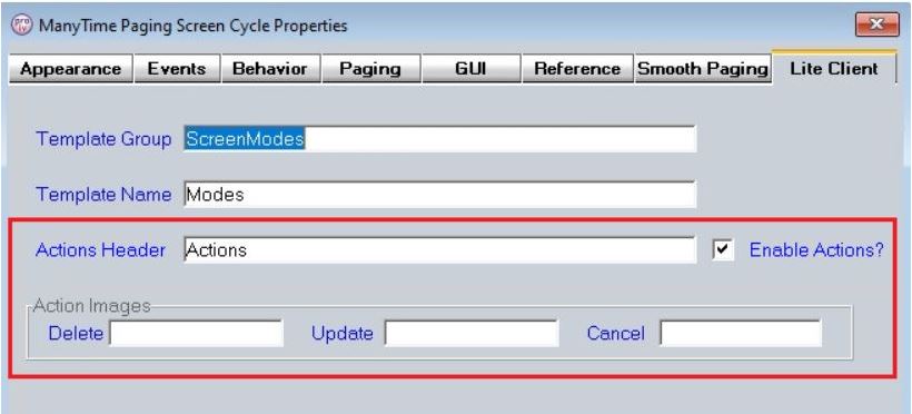
The image names can be either an image from the resources folder ora CSS icon. If the image is not defined then the following CSS icons are used:
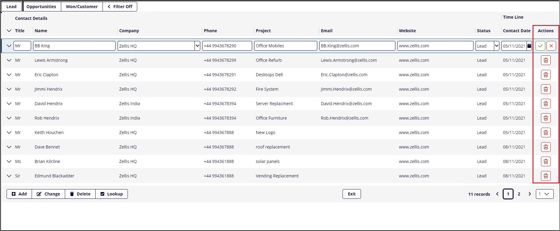
The cancel action is only available on the record that is currently being edited. Clicking on the icon causes the current record edit to terminate and the record to become selected but not editable.
The delete action is available on all records except the record that is currently being edited. Clicking on the icon causes a request for the record to be deleted. The demo is configured to output a message requesting confirmation.
The update action is only available on the record that is currently being edited. Clicking on the icon causes the current record edit to be saved and for the next record to become editable.
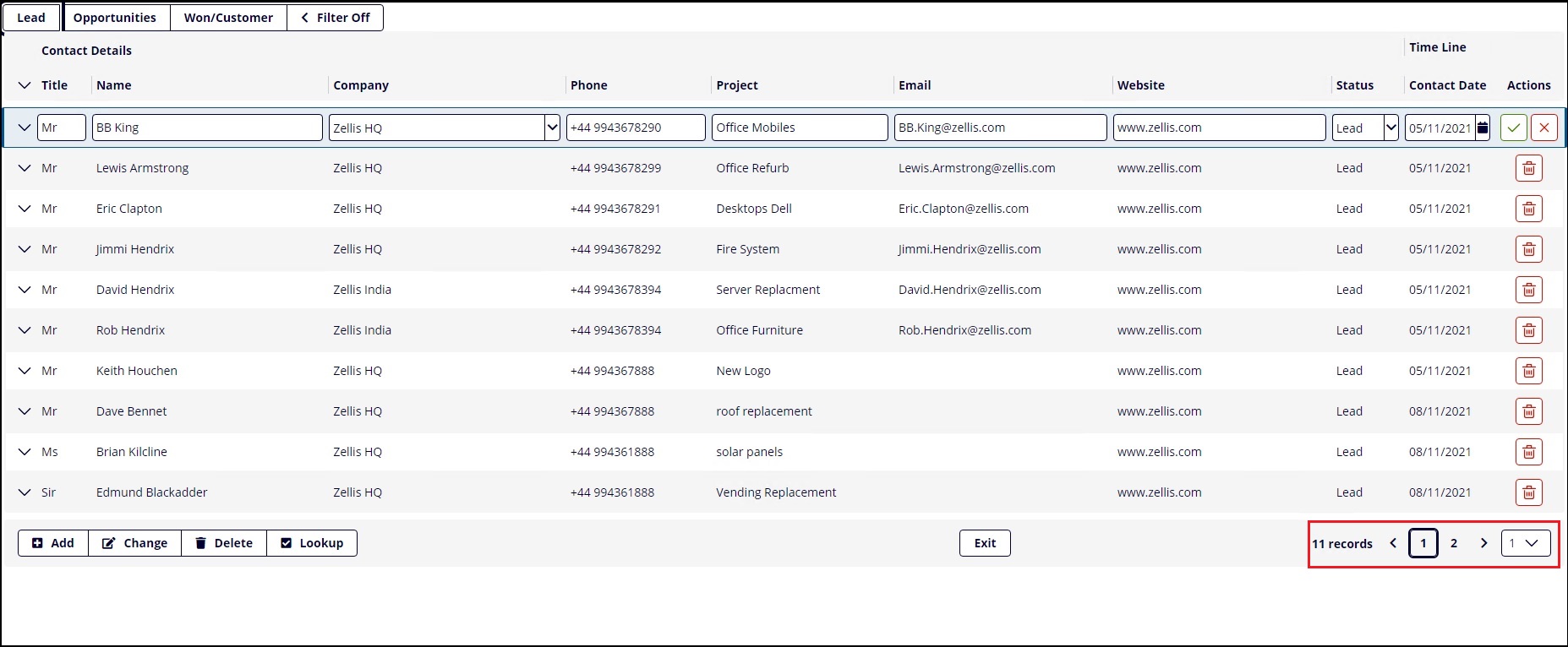
In Lite Client you will notice how the demo screen has a tool bar located a row proceeding the last record shown. This toolbar allows the quick page navigation by either selecting a new page number using the dropdown, simply clicking the forward or backward icons, or clicking on the page number itself. This control is integrated with the fluid grid component which is packaged in the Lite Client bootstrap css.
Column sorts have also been introduced. This means that when you click on "Name" or "Company" column the paging data is sorted based on that column. Columns with the capability of being sorted are denoted by greyed out downward pointing icon, sorted columns are denoted with a non-greyed out pointing icon which points up or down depending on the current sort order.
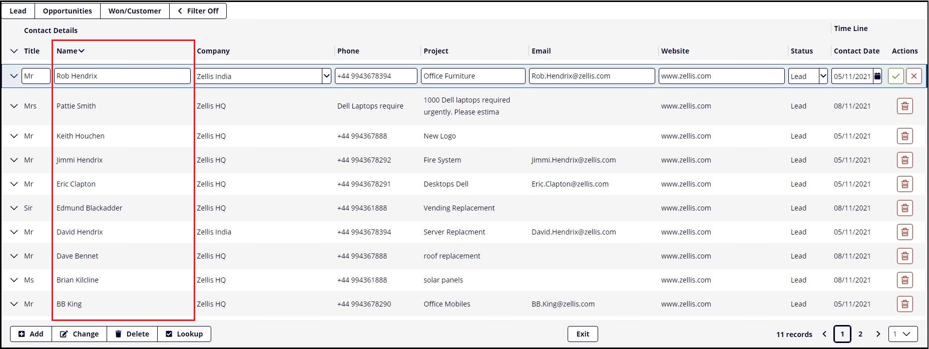
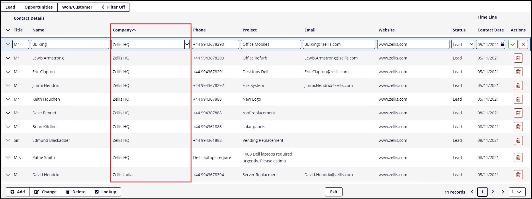
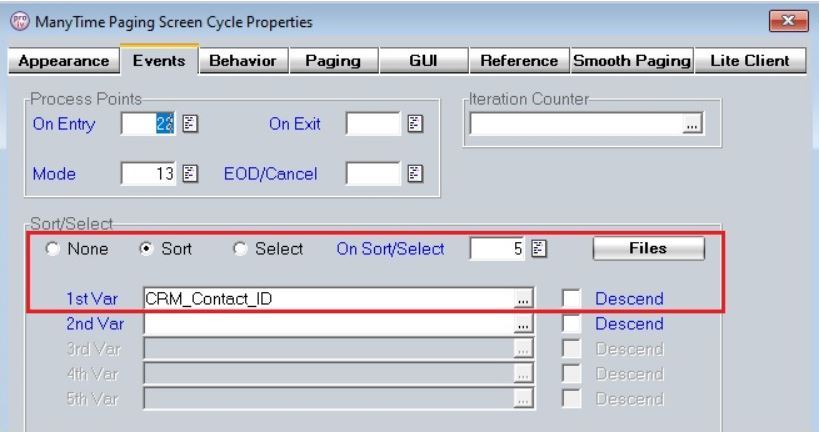
To achieve this we have set the columns to "Sort On Column Click", and included a sort on the primary file.
The Lite Client uses a combined combo box component that includes an input field and select, giving us a richer web experience. In our demo screen below, notice how the editbox entry is matched to the selection list.

Another unique feature of Lite Client is the ability to leverage specialised popup windows. These come in various flavours, which are as follows.
Each window type adds value to the user experience when leveraged in your Lite Client session. This PROIV demo has utilised the "Default" popup, by pressing the "Filter Off" button you are presented with the window, giving us the ability to filter the leads by customer.
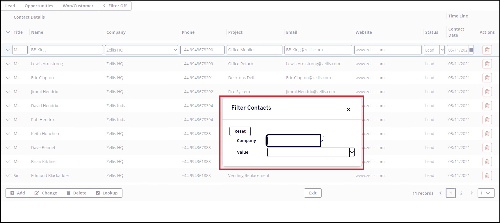
The window appears as a standard popup, however unlike traditional popups this window becomes translucent when it is repositioned, giving you visibility of the underlying data.
Topic ID: 870038