Component Templates |
Lite Client |
Component Templates |
Lite Client |
Many modern JavaScript libraries use templates to create HTML. These templates are usually written in HTML and loaded from the web server. The Lite Client also uses templates but because of the very dynamic nature of a PROIV session (components come and go) the templates need to be more flexible. For this reason, the templates are written in JSON (JavaScript Object Notation).
The Lite Client has a set of default templates that must be loaded (PROIVDefault.js). These templates define the way all the PROIV components are built from browser document nodes. The default templates are in the resources/templates folder.
The template for a component or a window can be changed by loading another template file specific to an application. The templates in this file can then be referenced by a new PROIV property in the components called ‘Template Name’. This template name is a name in the new template file of a component template. The template file may also contain a new group of templates that can be referenced by setting the PROIV property ‘Template Group’ in a PROIV screen cycle.
Defining and loading customised templates for an application is the way to give a PROIV session a completely new look to match an HTML page. Changing the CSS will let you change the colour and size of a component but the nodes that make up the component are unchanged. A new template can also change the nodes.
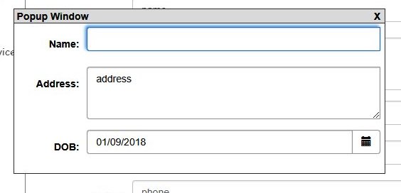
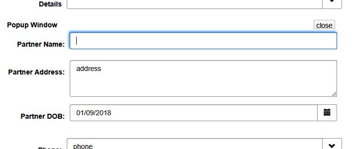
One area where a new template is useful is in a PROIV popup window. The default template for the popup window is as a separate draggable window that appears on top of the session components. A new template can change a popup window to appear embedded in a form. An example of this is shown below:

"PopupWindow": {
"class":"{{popup-window}}",
"style":"{{popupStyle}}",
"id":"{{windowName}}",
"draggable":"true",
"children":[
{
"class":"{{popup-header}}",
"dragTarget":"true",
"children":[
{
"class":"{{popup-title}}",
"innerText":"{{title}}"
},
{
"class":"{{popup-close}}",
"onclick":"onclickclose",
"innerText":"X"
}
]
},
{
"class":"{{popup-panel}}",
"isFieldNode":"true"
}
]
},
This shows a default popup window and its template.

"EmbeddedPopupWindow": {
"class":"{{form-panel}}",
"id":"{{parentPanelName}}",
"isPanelNode":"true",
"children":[
{
"class":"proiv-EmbeddedWindow
{{form-row}}",
"name":"{{parentRowName}}",
"isRowNode":"true",
"children":[
{
"class":"proiv-EmbeddedWindowHeader",
"children":[
{
"class":"proiv-EmbeddedWindowTitle",
"innerText":"{{title}}"
},
{
"class":"proiv-EmbeddedWindowClose",
"onclick":"onclickclose",
"innerText":"close"
}
]
},
{
"class":"proiv-EmbeddedWindowPanel",
"isFieldNode":"true"
}
]
}
]
},
This shows an embedded popup window (inserted between the Details and the Phone fields) and it’s the custom template. Note that it has its own CSS classes that must also be made available in the browser..
Each object in the JSON template file defines an HTML DOM element. The properties are the element attributes. Some of the properties are special and these are described below:
The value of an attribute is always a string and may use the following rules:
The CSS style attributes are not given values in the template file. Instead they always use an attribute token (see above). These tokens define an actual style from a PROIV property map file (e.g. PROIVPropertyMap_bootstrap4.js). This allows you to change the CSS being used, by loading a different map file, without modifying this template file.
Topic ID: 870026