Component Grouping |
Lite Client |
 |
|
Component Grouping |
Lite Client |
|
Buttons and Icons have a new property called ‘Component Group’. This property allows components in the same screen to be joined together into a single object on the screen. The components still perform the same operations (e.g. they can be clicked on) but they present a single visual block.
The Component Group property is a string and all components in a screen with the same component group string are grouped together. There can be more than one group on a screen.
Components in a group have an order and this order is taken from the row and column properties of the components. The component with the lowest row and column numbers is first and the order is then based first on the row and second on the column. The row is most significant and the column is least significant.
There are several types of groups and the Component Group property can have a suffix that identifies the type of group to be created. If there is no recognised suffix then a Button Group is created.
A button group is identified by a Component Group suffix of ‘/ButtonGroup’. A button group is a horizontal bar of buttons where each PROIV component will place its image on the left and its label on the right of a button. The group CSS uses the Bootstrap ‘btn-group’ for the bar and ‘btn btn-default’ for the buttons. Additional CSS can be given to the buttons by setting the PROIV ‘CSS Class’ property on the component. All other PROIV component properties are ignored for components in a group.

This shows a button group built from 10 PROIV Buttons. Note that button 6 has no image defined.
This shows a button group built from 4 PROIV Icons. This looks the same as a button group built from PROIV Buttons.

This shows a button group built from 3 buttons all without an image but each one has set the CSS Class property. The CCS is ‘btn-success’, ‘btn-warning’ and ‘btn-danger’. These are standard Bootstrap CSS classes and other Bootstrap CSS classes used for buttons are ‘btn-primary’, ‘btn-info’, and ‘btn-link’.
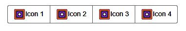
An icon group is identified by a Component Group suffix of ‘/IconGroup’. An icon group is a horizontal bar of buttons where each button is built from a PROIV Icon using the ‘Floating Label Mode’ and the ‘Alignment’ properties to position the image and the label inside the button. This allows the image and labels to be positioned in many different configurations inside a button. PROIV Buttons do not display inside an icon group.

This shows an icon group built from 4 PROIV Icons. All the Icons have the ‘Floating Label Mode’ property set true and the ‘Alignment’ properties are ‘Top_Center’, ‘Mid_Right’, ‘Bottom_Center’ and ‘Mid_Left’.
A navigation group is identified by a Component Group suffix of ‘/NavGroup’. A navigation group is a horizontal bar of buttons using the Bootstrap CSS ‘navbar’ and ‘navbar-nav’ classes. This is a bar that extends across the full width of the PROIV session with the PROIV Button or Icon label used as the text. The PROIV Button or Icon image is not displayed.
A PROIV Icon has an HREF property and if this is set the nav button is an anchor link. This anchor has a default target of '_blank' but this can be changed if the HREF has a suffix of | followed by the new value for the target attribute. A PROIV Button has no HREF and so will show just its text.
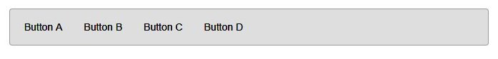
This shows a navigation group built from 4 buttons.
A tab group is identified by a Component Group suffix of ‘/TabGroup’. A tab group is a horizontal bar of buttons using the Bootstrap CSS ‘navbar’ and ‘nav-tabs’ classes. This is a bar that extends across the full width of the PROIV session with the PROIV Button or Icon label used as the text for an HTML link. The PROIV Button or Icon image is not displayed. The link HREF comes from the Component Group with an additional suffix.
A PROIV Icon has an HREF property and if this is set the nav button is an anchor link. This anchor has a default target of '_blank' but this can be changed if the HREF has a suffix of | followed by the new value for the target attribute. A PROIV Button has no HREF and so will show just its text.
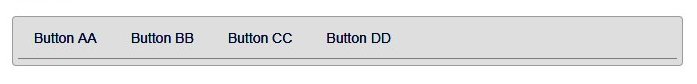
This shows a tab group built from 4 buttons.
A PROIV Icon HREF property can be a JavaScript call rather than a URL. This allows the developer to access JavaScript on the page through a Navigation Group or Tab Group button.
e.g.
HREF = JavaScript:alert("hello world")
This example will call the browser alert function to display the message 'Hello world'.
Topic ID: 870031