The Combobox Object |
Lite Client |
 |
|
The Combobox Object |
Lite Client |
|
The PROIV Combobox is much like a browser select component with a drop-down list to select one or more values. But because the Combobox allows the user to edit the value as well as select the value, we can not use a select component, so the Lite Client uses a combined component that includes an input field and a button. The list that is dropped down is a compromise between the simple browser select list and the complex Open Client list. The list will display the data in columns, but the user can not rearrange or sort the columns.
The width of the list is set to the same width as the Combobox input field which means that as the screen size changes the width of the list changes and can become too small to show the data in all the columns. The list is allowed to scroll horizontally if it becomes smaller than its data.
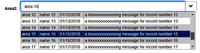
This shows a Combobox with the list dropped down and line 15 selected.
Topic ID: 870007